Facilitating a Design Sprint for WinklaarWorks
As part of a project with Bettina Meléndez (opens in new tab) for WinklaarWorks, the future website of the Dutch artist Shahaila Winklaar, I planned and facilitated a small design sprint. Design sprints usually take part over 5 days (or 4 days, according to AJ&Smart’s) with a big team of people from different fields, in order to bring together expertise in those fields into a brainstorming effort.
In this project we’re only 2 people and we didn’t have 5 days to spare, so I had to be inventive in the planning.
I decided to prune parts of the design sprint that we could do earlier or push to a later time, so we took some time to do proper user research before to be able to bring it into the design sprint, and we decided to take the time to create a proper prototype afterwards, without it having to be part of the design sprint. I also compressed the Understand and Define phases into an Understand-and-Define phase.
In order to help me plan and facilitate, I used Google’s design sprint kit (opens in new tab).
The plan
The challenge for the design sprint was to come up with 2 different flows/ideas to increase sales and to inform the visitors about what the artist is up to.
The final agenda planned for 6 hours of work divided like this:
110 minutes for the Understand-and-Define phase (including 2 breaks)
55 minutes for the brainstorming part of the Sketch phase
60 minutes lunch
90 minutes for the sketching part of the Sketch phase (including 1 break)
25 minutes for the Decision phase
We tried with partial success to stick to this agenda, and we added more time at the end to plan the next steps and to decide what we were going to include in our prototype. It turned into a sort of quick brainstorming session, and we finished the day with clear ideas on what we wanted to do.
The agenda for the design sprint: in all, it took in all a little less than 6 hours
The Understand-and-Define phase
Kicking it off
I decided to kick off the design sprint with a jobs-to-be-done exercise so we could empathize with our users.
We looked at the research that we had conducted and the answers to the questionnaire that we had sent out to a few existing and potential customers.
The exercise consisted on 5 minutes of writing those jobs-to-be-done in the form of “when/I want to/so I can” sentences, like these ones:
When I want to buy an art piece I want to find what its story is so I can connect emotionally with it
When I like the artist’s work I want to find out about next events so I can go see their stuff in real life
When I like the artist in an exhibition I want to find more information about them so I can decide if I want to buy their art
The outcome of this exercise, after grouping the sentences thematically, was the following 5 aspects we thought important:
Users want to connect emotionally with the artist and their art
Users want information about a piece and see it in real life so they can make a decision
Users want to show the pieces to someone else
Users want to find the artist in social media and get information through that
Users want to find information about events and other information about the artist
How Might We (HMWs)
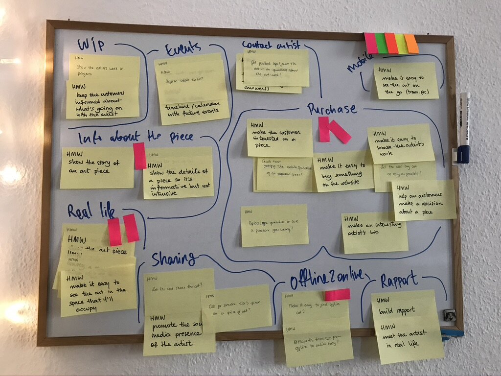
Once we had narrowed down our focus, Bettina and I spent 10 minutes doing a HMW exercise. Using sticky notes, we wrote down single pain points that we could see or foresee in the user journey, and we framed them in a positive way.
HMWs on the whiteboard
Affinity mapping of our HMWs
Our HMWs included ones like these:
How might we share events and get people to participate in them?
How might we show the art piece “in real life”?
How might we let the user buy art as easy as possible?
Finally, we created an affinity map of our HMWs with the following sections: work-in-progress, events, contact the artist, mobile, purchase, information about the piece, real life, sharing, offline to online, and rapport.
Finally, we each had 3 votes that we distributed like this: 2 in purchase, 2 in real life, 1 in information about the piece, and 1 in offline to online.
It was time to move to the next part.
Our whiteboard after voting on the HMWs
Now-Wow-How matrix and Goal-Signal-Metric
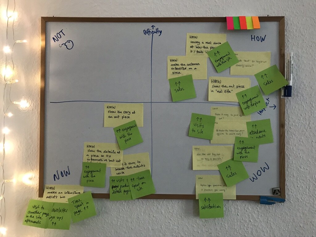
Once we had a clear idea of what we wanted to focus on, we narrowed it down further to achievable objectives for the day. In order to do that, we created a Now-Wow-How matrix, in which we mapped the HMWs that we had selected according to their difficulty and impact. The more impact they have the more interesting they become, but if they are too difficult then they might be the target of a different session, or they would be postponed until we can figure out how to do it..
After we had mapped them, we created Goal-Signal-Metrics for them. GSMs are a way of understanding the HMW, and how their impact can be measured. Figuring this out in advance becomes very useful once the feature is developed, as we can measure the impact it has.
Some of the GSMs we assigned to the HMWs were: increased visits to site, increase in satisfaction score, increase in sales, increased engagement with the art piece, etc.
Our HMWs mapped out in a Now-Wow-How matrix
The GSMs that we came up with for the HMWs
Once we understood our problem, what we wanted to solve, how difficult it would be, and how to measure the impact of possible solutions, it was time to move on the next phase, my favorite one.
The Sketch phase
This is my favorite phase because here we do most of the brainstorming and ideating in the design sprint. It’s very challenging in a way that I find very rewarding even when it’s really hard to push your creativity to its limits in a sometimes quite stressful process. I like the silent sketching, and I like putting all of the ideas together and start to see ideas coalescing into concrete actionable points.
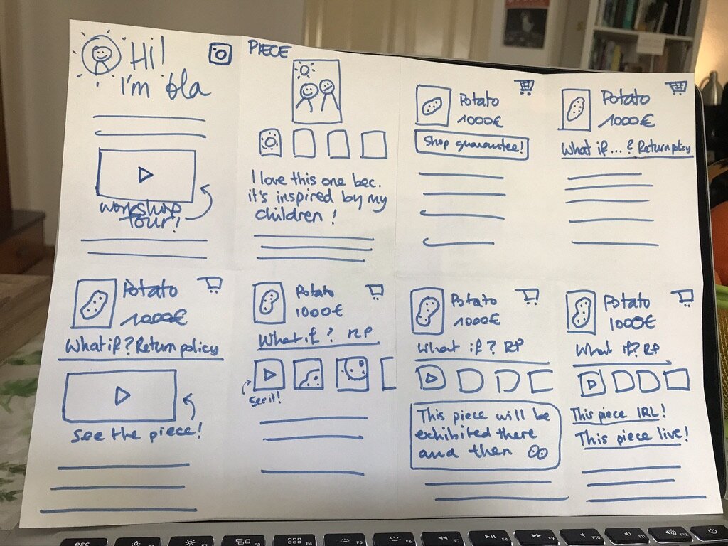
The Crazy Eights
For those not familiar with the exercise, it works in the following way: each participant takes an A4 piece of paper and folds it half three times, ending up with a paper divided in 8 sections; each of those sections represents a screen; every participant then takes a sharpie and has one minute per screen to sketch a solution to one or more of the HMW problems from the previous phase.
I love this exercise, at it’s always quite challenging and I love how ideas come up just by building up on the previous sketches. Just having one minute to come up with an idea and then sketch it really gets your creative juices going!
Bettina’s Crazy-8s sketches
My Crazy-8s sketches
After the Crazy-8s session ended, we presented our sketches and the ideas in them.
Finally, we voted on the most promising solutions that were in those sketches, coming up with new solutions while we talked about them. We were very satisfied with the result of the session and the discussion afterwards.
The Crazy-8s that we came up with, and the result of the voting
The solutions and ideas that we settled in after the voting and the discussion were the following:
Making it clear to the user what the return policy and the buying conditions are, to increase trust and make it safer for the user to buy a piece
[4 votes]A step-by-step journey of a final art piece, so the user can have an overview of the story of the piece and look at specific steps (materials, assembly, design, etc.)
[3 votes]A list of events and exhibitions happening nearby, with the option to switch to a map view, so the user can find places where to look at a piece in real life
[2 votes]A video showing an art piece in real life (an exhibition, the workshop, a living room, etc.)
[2 votes]Telling the user what the inspiration behind an art piece was
[1 vote]Showing the user a video of the artist in their workshop or during their daily routine, to increase the rapport between artist and customer
[1 vote]
The solution sketches
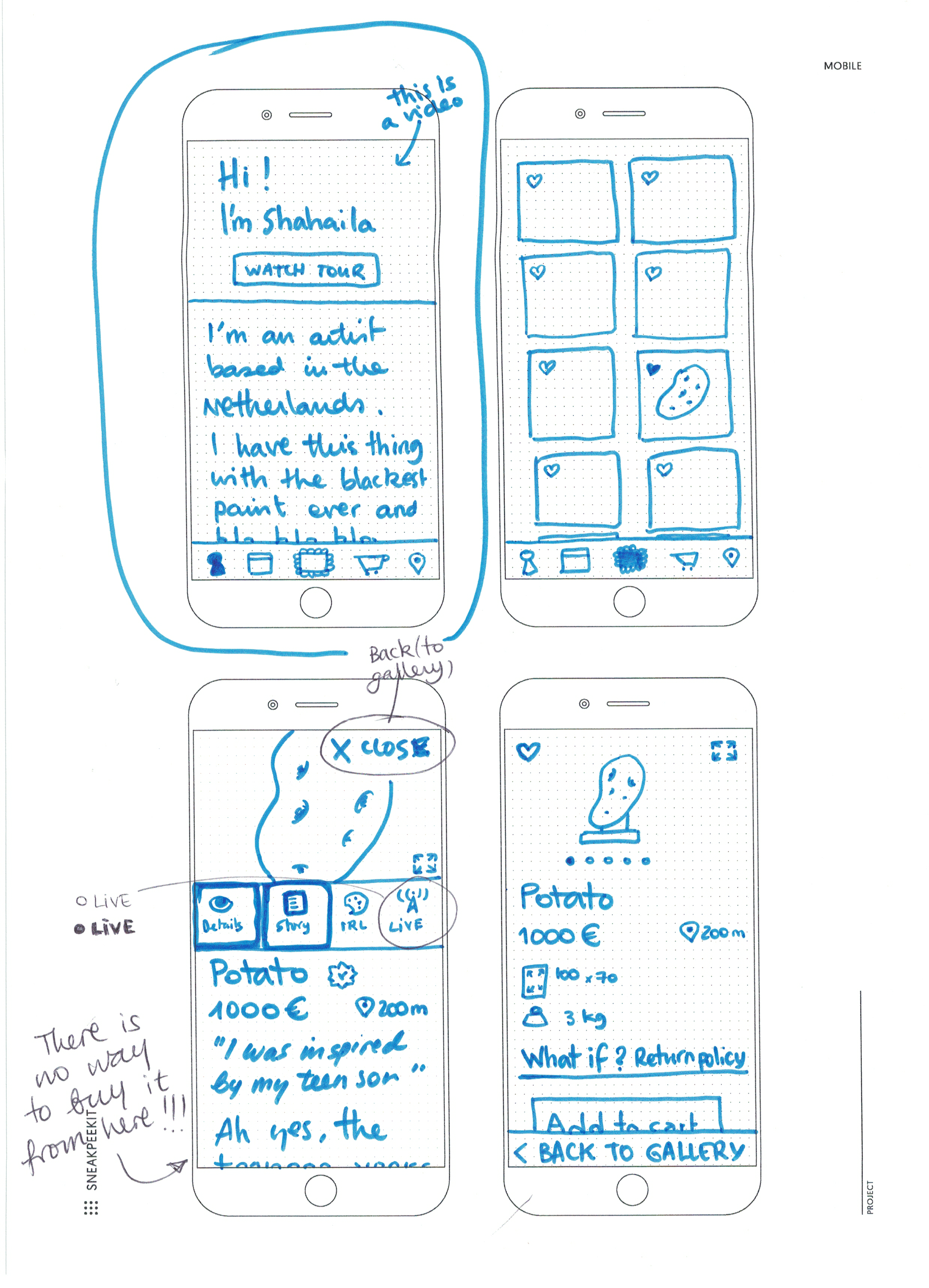
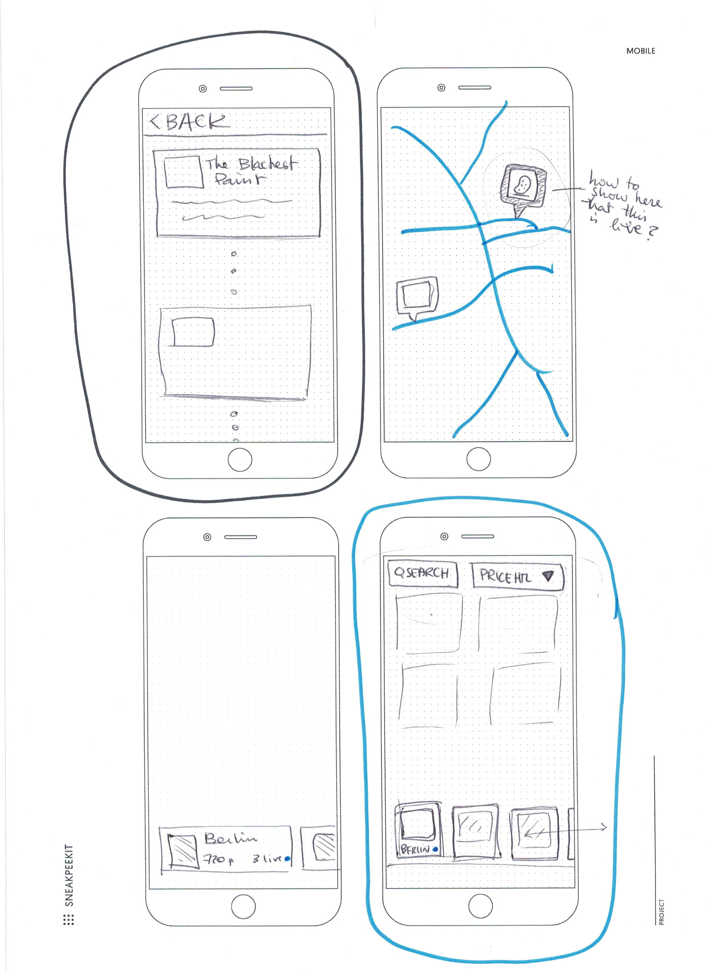
After the voting and the discussion, we had a break for lunch before diving into silent sketching. This part of the sprint consisted on one hour of sketching alone, without sharing ideas or collaborating. Inspired and guided by the work we had done before, we brought in thoughts from our competitor analysis, from the Crazy-8s, from our discussions pre and post voting, etc.
We used Sneakpeekit phone templates so we could have a better sense of what could fit in a phone screen.
Looking at these sketches and discussing them to plan what to do in the next phase of the development was our last exercise of the design sprint. We compared the solutions that we had come up with, and why and how would they work. We looked at existing tools like Foursquare that inspired us, and how other products in the market approach some of the issues that we had designed.
Finally, we decided to move forward with a prototype with 5 items: the map with the list of nearby art, a gallery to show the art pieces, an about page to talk about the artist, a story to showcase the life of a specific piece, and a product description page (PDP) that shows the characteristics of an item and allows the user to add it to a basket in order to buy it.
Next steps and conclusion
After the design sprint was over, we started working on a prototype to show the client.
This will allow us to get direction in the design that we’re creating, as well as keeping the client updated with the product that we’re designing for them.
Some of the next steps that we planned at the end of the day were
The creation of a prototype
Planning usability testing with the prototype
Create a design system and a tone of voice to be used in the design and in the content the artist creates
Conclusion
Planning a design sprint in just one day was a challenging task, and one that I was reticent to tackle in the beginning as it’s simply a lot of activities to do in a very small amount of time. A point in favor, which helped me decide to do it, was the fact that we were only two people participating.
I cut some corners, merged activities, and warned Bettina that we’d be rushing through the sprint, but in the end everything turned out to be simpler than what I thought. The good planning in advance was very helpful, as I had shared it with her in advance and discussed what everything meant before we went into the sprint, and that helped speed through the various exercises.
The reason why it worked because we were only two people is that most of the time in a design sprint is used in explaining both the exercises by the facilitator, and the outcomes of the exercises. Going one by one describing a sketch or a solution takes a long time when there are 7 or 8 participants in the meeting or workshop. I also decided to do without some of the exercises, or to do a short version of them (that’s the case of the competitor analysis exercise, for example), which worked because the problem is not as complex as other ones.
Deciding to not do the prototyping hour that I had planned at the end was motivated by Bettina being novice with a design software like Adobe XD, and by the sprint running already a little too long. Because prototyping is a fun and cool activity that gets me in a state of focus, we didn’t want to rush it, so we did an online version of prototyping together the week after the design sprint. This way I had the time to explain both the software and some of my design decisions to Bettina, and we could then split the work between the both of us.
We had a first version of a prototype after a week, and the first review by the client was very positive.
Next steps after this, polish that prototype so we can have a usability test set up in the following days.
Questions? Suggestions?
If you have questions about this project, or suggestions to improve the one day design sprint process, or would like to chat about this project or something else, please just send me a line!


